Interior Design
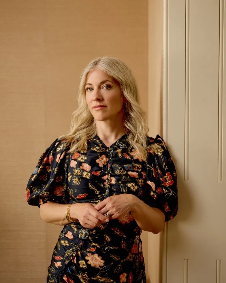
Notes on Design With Nicole Salvesen
In this month’s Notes on Design, Nicole Salvesen reflects on the thoughtful use of pattern and detail to bring warmth, longevity and ease to everyday spaces.
Incorporating pattern

When did your love for pattern begin, and what early influences shaped it?
I have been drawn to pattern from a very early age, whether in clothing or interiors. There is something deeply comforting and familiar about it, and those early impressions tend to stay with you. Growing up surrounded by characterful, layered spaces undoubtedly shaped that sensibility, along with a lasting attraction to rooms that feel expressive and lived-in.
As a designer, that instinct has become more considered over time. I have perhaps learned to dial it back slightly, but it feels like a natural progression rather than any real shift away from it.
How can pattern transform a room, and why choose pattern over plain surfaces?
Pattern has an extraordinary ability to bring a space to life. It introduces movement, depth and layering that plain surfaces can sometimes lack. At the same time, it can provide a gentle backdrop that allows more personal elements, books, artwork and collected objects, to come into their own.
It is not purely decorative either, it can be wonderfully practical. In a busy home, patterned fabrics tend to be far more forgiving than plain ones, and they can soften or even celebrate those slightly awkward or sentimental pieces that might otherwise feel difficult to place. Ultimately, pattern allows a room to feel both beautiful and liveable.
How do you use colour within pattern to create a cohesive scheme?
We often begin with a hero fabric and build the scheme outwards from there, drawing on the colours within it as a natural foundation. It is an approach that creates cohesion while still allowing for a sense of freedom.
One example is our Romilly Original, a gentle trailing motif that initially reads as blue, but reveals layers of softer tones on closer inspection, yellows, browns and pinks woven through the design. These nuances can be echoed across curtains, upholstery, paint and accessories, allowing the room to evolve organically.
We also like to introduce a bolder counterpart, like our Woven Ikat, something with a stronger scale or clearer contrast, to bring energy and balance. By amplifying certain tones and softening others, we can shape the mood of a space so that it feels layered and harmonious without appearing overly controlled.
What are the key principles when mixing scales, and are there rules for where different scales should be used?
It is important not to impose pattern onto a space without considering its character. We always take cues from the architecture and the quality of light, allowing the room itself to guide decisions.
In terms of scale, contrast is key. We tend to combine larger prints with smaller, more understated patterns, unified by a shared palette. This creates visual interest while maintaining a sense of cohesion.
There is also something compelling about playing with scale in unexpected ways. A large-scale pattern in a smaller room, for example, can feel impactful and full of personality. It does not need to be perfect, that is very much part of the charm.
What advice would you give to someone fearful of making expensive mistakes when using pattern?
Confidence is key. Pattern tends to reward a certain boldness, and often the more thoughtfully it is layered, the more successful a room will feel.
That does not mean everything needs to be busy, it is about balance. We always incorporate a mix of patterned and plain elements, alongside a variety of textures. A light-absorbing cotton velvet, for example, can offset the sheen of a glazed chintz beautifully.
Layering extends beyond fabric, it is present in flooring, lighting, artwork and even paint finishes. When considered as a whole, these elements work together to create depth and longevity.
How do you tell if a pattern clash works or not, and what makes it feel intentional rather than overwhelming?
A successful clash rarely happens by accident, it comes down to balance. If there is a common thread, often through colour or tone, the combination will feel considered rather than chaotic.
Pattern is a powerful tool. It can unify a scheme, disguise imperfections and give a space a clear identity. There is also a long tradition of layered interiors to draw from, particularly in Georgian and Arts and Crafts design, where richness and restraint sit comfortably together.
We are seeing a renewed confidence in this approach. Interiors are becoming more personal again, and pattern plays a central role in that expression.
What are your current favourite fabrics or wallpapers?
Our latest collection feels like the most complete expression of how we design together. Every colour, scale and pattern has been developed with versatility in mind, so that the pieces sit effortlessly alongside one another. There is a real ease to working with it.
I am particularly fond of Gussie River, which takes its name from my much-loved spaniel and now sits in my daughter's bedroom that has become something of a family favourite. It is always a good sign when a space is quietly envied by everyone else.
What makes pattern choices feel quintessentially English versus American?
The distinction often lies in colour. American interiors tend to favour clearer, brighter tones, while English schemes are typically softer and more muted.
What is interesting is that what we think of as quintessentially English is actually highly eclectic. It draws on influences from across the world, Indian paisleys and chintzes, Persian and Turkish rugs, Chinese silks, all layered together over time.
It is this sense of accumulation and ease that defines it. A room feels richer and more complete when it reflects a breadth of influences gathered gradually rather than assembled all at once.
Item has been added
to your basket!